- Typical new classrooms often feature shiny floors and lots of decor.
- Thinking they’ll improve student outcomes makes them a waste of money.
- Even worse, such classroom design mistakes can hold students back.
Smarter design may require a small down payment of time and energy, but it shouldn’t cost you more money than traditional, ineffective design.
In fact, your current design may even be costing you.
In addition to all the money you’ll spend on teachers and tech, you may also blow thousands or even millions of dollars on poorly considered construction and furnishings that you’ll have to live with for decades.
Districts and schools do this every day. Wasting tax dollars (or the money parents paid in tuition) isn’t the worst part; it’s that poorly designed spaces hurt students by putting them in detrimental environments. Studies show that well-designed physical classrooms aren’t just nice to have; they’re an essential part of the infrastructure of learning environments.
For example, in one set of experiments, students in classrooms with the most natural light outperformed those with limited classroom daylight by 20% in math and by 26% in reading. In The Great Indoors, author Emily Anthes cites one study that confirms students perform better on attention tests when their classrooms look out onto natural landscapes or feature plant-filled “green walls.”
Unfortunately, the typical classroom is a hodgepodge of missed opportunities that plague the school community for years to come. Here are seven design mistakes that are costing schools.
1. Clocks at the head of the class get students counting the minutes
Teachers need to know what time it is, but there are better options for time management that let students focus on their work and get into a flow state.
If the room is designed for lectures, it works just as well to hang the clock on the back wall, so the teacher can keep an eye on it. If the room is for more collaborative or project-based work, then the clock can be discreetly located in a place that only the teacher knows to look for it. Another easy option is for the teacher to wear a watch.
2. Shiny, reflective floors create glare and lead to overstimulation
Schools often choose hard floors because they withstand wear and tear better and are easier to clean. But the downside of traditional hard floors are glare, noise, and a clinical feel.
When Kurani needs a hard floor, we often turn to a matte finish, so, at the very least, it’s easy on the eyes. Our favorite option is a natural, plant-based tile that’s made from linseed oil. It’s affordable, easy to clean, and durable—good for you and the planet.
3. Small, triangular desks give students no room to spread out
Triangular desks are a popular choice because they allow for grouping in a way that rectangular desks don’t. But triangular desks are also inherently narrow, so you need to make sure they’re big enough for students to feel unconstricted.
When we designed the Imaginarium Classrooms at the High Tech Elementary School in Denver, we kept those considerations in mind. The final product is much more relaxed and expansive.
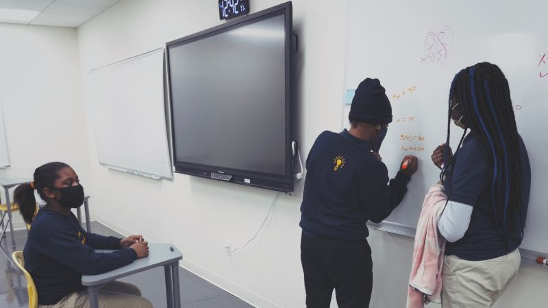
4. Small dry-erase boards lead to wasted wall space
Instead of hanging a small, self-contained board, why not use dry erase paint on an entire wall of the room from ceiling to floor and corner to corner?
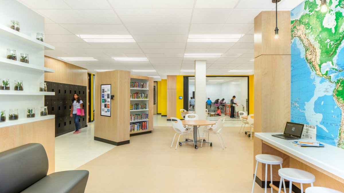
At the Khan Lab School, in California, many of the walls are floor-to-ceiling dry erase, so students have more area for brainstorming and working. In fact, when researchers from Stanford University conducted a study of the school, they concluded that “changes that seem trivial at first, like having…a plethora of whiteboard walls, engage and activate students.”
The Stanford study pointed out that “all students interviewed mentioned the whiteboards along the walls as an important aspect of the classroom.”
5. Seat wiggling causes chairs to screech on the floor
Typical chairs make a lot of noise, especially with restless students using them. How will students focus with so much noise?

Poor acoustics from floors and other hard materials in classrooms make it difficult for students to remember things. That’s why you see so many teachers slice tennis balls and put them on the feet of all their classroom furniture.
Instead of choosing outdated desks and chairs meant for students sitting motionless, try carpeted floors, furniture with wheels instead of regular feet, or furniture with glides.
6. The desks all face forward
Most educators agree that sitting in lectures should play a small part in a student’s learning experience. That’s even more true for Black and brown students: Studies have shown that students from these populations are more engaged by cooperative learning, so a lecture-style is particularly flawed.
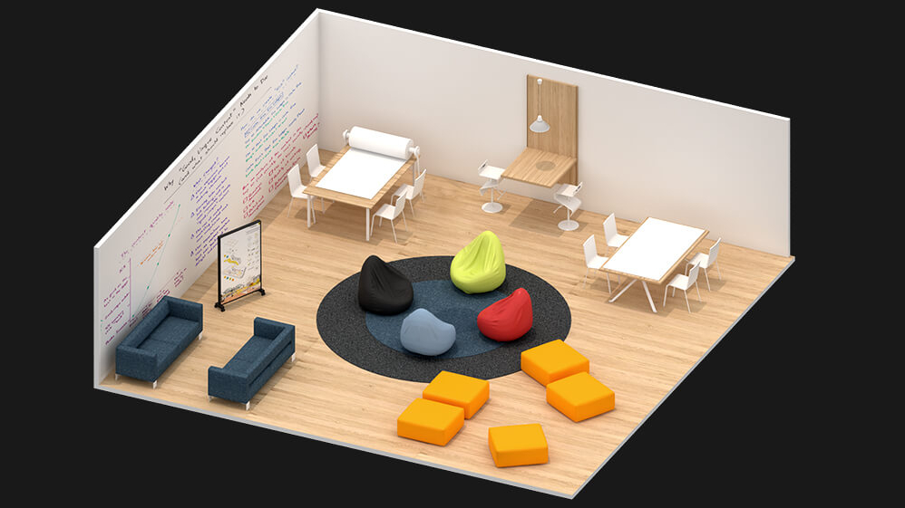
A better classroom layout takes into account the school’s students, learning model, and pedagogy. Arranging desks in small circles promotes group discussion; in a U-shape, the whole class can come together around new ideas.
7. There aren’t enough electrical outlets
In most modern classrooms, students will likely use devices at some point during the day, and powering those devices is a key consideration in classroom design. A good rule of thumb for accessibility is to have one outlet for every four students, and many classes fall well short.
That said, there will always be spaces that need even more electricity. For example, a classroom with tons of equipment like 3D printers will need more outlets—yet another reason to consider how the space will actually be used, and think about what kinds of classroom design serve those use cases best.